Psychology of color in Marketing
Color is a powerful tool in the world of marketing. Not only can it greatly impact the mood and emotions of your customers, but it can also make or break the success of your brand. It’s said that up to 90 percent of snap judgments about products are based on color alone, making the choice of colors for your brand of the utmost importance. What makes color so important? While some may believe that the choice of color is a simple matter of personal taste, the truth is, colors have deep meanings and evocations. Each color creates a different emotion and message within the viewer. Understanding these meanings can be the difference between a successful brand identity and a failed one. Here are the colors you need to know, and how they’ll make your customers feel:
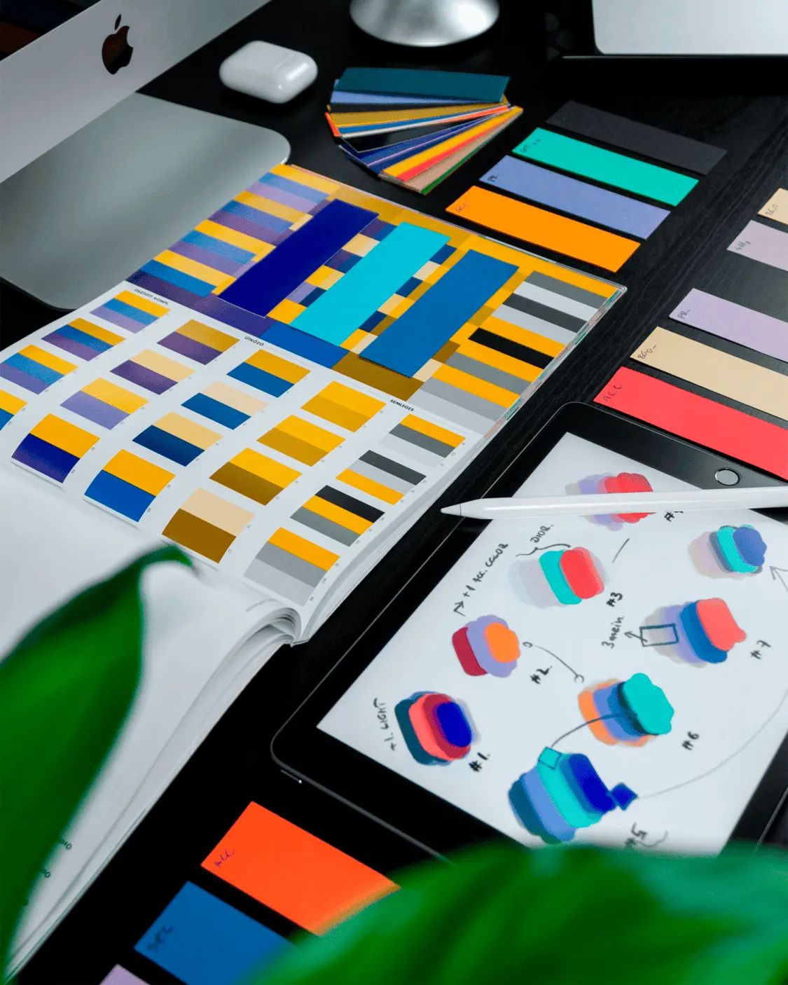
Color is a powerful tool in the world of marketing. Not only can it greatly impact the mood and emotions of your customers, but it can also make or break the success of your brand. It’s said that up to 90 percent of snap judgments about products are based on color alone, making the choice of colors for your brand of the utmost importance. What makes color so important? While some may believe that the choice of color is a simple matter of personal taste, the truth is, colors have deep meanings and evocations. Each color creates a different emotion and message within the viewer. Understanding these meanings can be the difference between a successful brand identity and a failed one. Here are the colors you need to know, and how they’ll make your customers feel:
- Red is the color of urgency, excitement, and energy. It can raise the heart rate and stimulate the senses. Used in marketing to stimulate sales, this color can evoke feelings of hunger and stimulate the appetite (which is why it’s commonly used in the fast food industry). It can also stimulate impulse buying and is perfect for calls to action.
- Yellow is the color of happiness, warmth, and optimism. As the brightest color of the visible spectrum, it’s the first color to capture our attention and is often the most visible to the human eye. This is why it’s commonly used for window displays and signs. Yellow appeals to children and grabs the attention of window shoppers. However, yellow can cause visual strain if used too much and should be used in moderation as an accent color.
- Blue is the color of trust, stability, calmness, and reliability. As the most popular color around the world, it has a soothing effect and represents professionalism. This is why it’s commonly used by corporate America, health care, and tech companies. Blue conveys a sense of credibility and is a perfect choice for any company that wants to establish trust with its customers.
- Orange is the color of fun, youthfulness, and playfulness. This warm color represents creativity, enthusiasm, and warmth. As the perfect blend between red and yellow, it has the excitement and stimulation of red, but in a less aggressive way. Orange is used by brands that want to convey a sense of energy and friendliness while standing out in a sea of blues and reds.
- Green is the color of nature, growth, harmony, and balance. As one of the most calming colors to the human eye, it’s perfect for companies that represent health, wellness, and eco-friendliness. This balancing color is also associated with good luck, prosperity, and financial success.
- Purple is the color of luxury, wisdom, grandeur, and creativity. Historically associated with royalty, it’s used by premium brands, beauty products, and creative companies. This rich color has a creative and imaginative feel and is perfect for companies that appeal to the senses and creativity of their customers.
- Black is the color of power, elegance, and sophistication. Representing glamour and refinement, it’s the perfect choice for luxury brands, fashion designers, and tech companies. Black can add depth, seriousness, and warmth to a brand, but when used in excess, can give a negative impression.
- White is the color of purity, cleanliness, and simplicity. Representing innocence, peace, and neutrality, it creates a sense of breathing space and is commonly used by brands that want to convey a clean and modern feel. One of the most common uses for white is in its negative form to create space and make other elements stand out.
How to Use Color Psychology for Your Business
While the meanings behind different colors are helpful, knowing how to use them for your business is another story. Here are a few ways to apply color psychology to your business:
- Match your color to your personality: Make sure that the colors you choose match your brand personality and the overall message you want to convey.
- Consider your audience: While colors evoke different emotions in different people, some meanings may be lost on certain age groups, cultures, or industries.
- Use color to draw attention: Use color to guide the eye to specific elements that you want to draw attention to.
- Create color consistency: Use the same colors consistently across all mediums to avoid confusing your customers and diluting your brand.
- Test your colors: Try different color combinations to see which ones work best for your brand and target audience.
The Bottom Line
At the end of the day, color is not just for aesthetics; it’s for results. By choosing colors that evoke the right emotions and message for your business, you can increase the effectiveness of your branding. So, next time you’re choosing the colors for your brand, remember that it’s not what you like, but what you want your customers to “feel.” Whether you’re a seasoned pro or an amateur designer, don’t be afraid to experiment with different colors and see what works best for you. With a little practice and patience, you can create a visually stunning brand that effectively communicates your message and sets your business up for success.